@brad - liking this!
Some excellent comments from the early adopters. Wiring mode definitely stimulates a different kind of thinking.
As with any conventional patchbay, the initial connections are easy to deal with. It’s when you have to dive into a rat’s nest that things can get messy. Looking forward to seeing how this develops.
Nice work Brad!
2 Likes
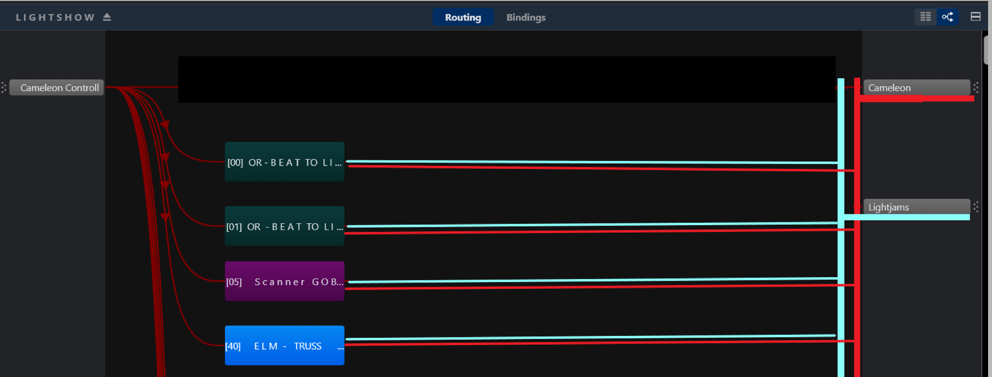
Having used the routing diagrams mode for a while in my songs, I’ve noticed a common theme in layouts. It might be driven somewhat from the type of music I play with my band, where songs tend to have lots of parts and many different sounds. What I’ve noticed is that the wiring structures tend to be vertically tall (lots of racks/plugins for different sounds) but relatively shallow (not much chaining). Some songs have 20-30 racks, but a shallow structure with little or no chaining (all my chaining and complexity tends to live inside racks). Laying things out in an attempt to keep as much as possible visible results in lots of overlapping routes and clutter. Here’s an example (zoomed right out so you can see the full structure…but meaning it’s a bit blocky if you zoom in):

Note that the MIDI input routes for all those racks are not visible because they’re not present in this particular song state.
This is the kind of view I get when setting things up, when not fully zoomed out:
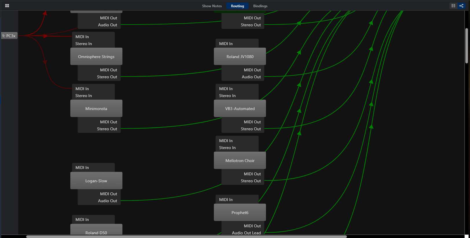
Consequently I find myself scrolling up and down a lot. The problem with this is that once you need to scroll, some routes just go off-screen, and you can’t easily tell where they’re going. Furthermore, much of the visible wiring is standard stuff - routes from a MIDI in to instrument racks/plugins, and routes from them out to audio output ports, and these tend to be the routes that end up with long bezier curves going off-screen.
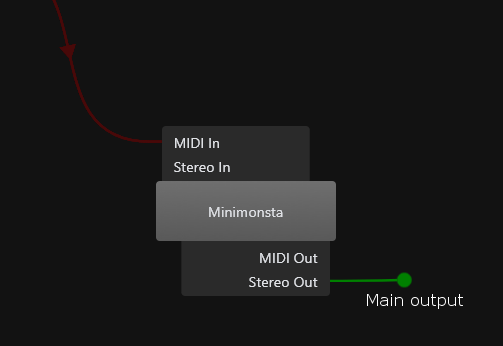
So I was thinking that it might be nice to be able to designate a route endpoint as a “stub”, where all routes to/from that point get drawn as a little short stub at each end, rather than the whole bezier curve. Perhaps the stub line could be labelled with the destination (although this might get messy for endpoints with lots of routes in/out).
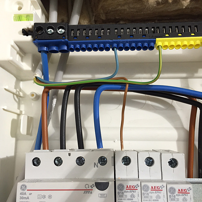
The idea is analogous to in electronic schematics, where some common connections such as “ground” are done locally with a symbol, instead of including all of the wiring to a single ground point, like this:
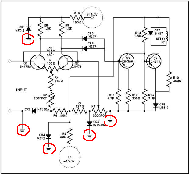
I think it would be really useful to de-clutter complex setups, especially those which have ports that are hubs for many routes, with lots of “fan-out”, such as a main MIDI in or an audio output. It would also make it clear what such an input/output is, without having to have the other end visible on-screen, and make it easier to focus on the more interesting routing structure.
Thoughts?
Neil
4 Likes
As a former electronics engineer, it makes perfect sense to me, and would declutter diagrams. I guess another option would be like the Nord G2 Modular editor where you can hide cables of different types?
2 Likes
Perhaps an option to toggle on/off midi routes vs audio routes might be useful?
2 Likes
Hi Neil,
I do a little electronics repair so the idea has appeal because I am used to it but I too worry about it getting messy and possibly difficult to manage as you zoomed in and out. Also it is in a sense a hybrid layout which uses label boxes like the table view already has. An idea might be to have it so that your “stub” appeared when you moused over the route in question thereby cleaning up any potential “messes”. Just my 2 cents.
Very cool Adrian! It gave me a thought, what if folks that had long vertical views could switch the view to horizontal so the inputs were on top, the outputs were on the bottom and the racks and plugins arranged left to right. It might help with Neil’s issue he brought out.
Dave
2 Likes
Unfortunately, many have no idea how an electronic schematic is read. I worked with schematics for over 20 yrs, so I understand the concept. Perhaps a sketch would be a much better representation of the suggestion and may even provide a solution to a less cluttered view by the many talented minds here. Again, just my 2 cents which I still can’t afford.
1 Like
I thought about that too, but it would only give an advantage in proportion to your monitor’s aspect ratio, which isn’t a huge difference. And I’m guessing it would be quite a lot of work for Brad, to re-engineer the boxes to work the other way round, for what might only be a marginal benefit to a subset of users.
With this kind of layout problem there will always be some layouts that work beautifully, and others that just can’t be done in a nice way - it’s the nature of the beast. Layouts best represented in a very wide or very tall configuration will always end up having to compromise, once they need to be rendered onto a display.
2 Likes
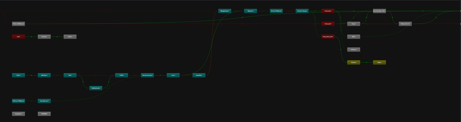
This is the kind of thing I had in mind:
Where an route endpoint has multiple routes connected to it, one label wouldn’t be sufficient.It would maybe need a list, or a hover tooltip that lists the connected destinations or suchlike.
Neil
1 Like
@brad - is there a chance that ‘audio bypass’ will be available in the drop down menu in wired mode? It’s not a huge deal to travel to the slot at foot of window - but as ‘suspend’ is already in the dropdown it sure would be nice to have its cousin in there too.
Adrian
1 Like
@brad (Not directly related to routing diagrams). I think I found a bug in Experimental Build 3585. System Wide Keypress isn’t working in the background rack. I reverted to 3570 to confirm and it does work in that build. I’ll need to suffer without the VERY COOL visual routing for now.
What about a way to set an object to “float” mode, where it stays stationary in the window as you scroll around. So instead of the Output Rack being fixed in the overall diagram, it’s fixed to the window viewport. It would require redraws while scrolling, but at least specified objects would stay in view at all times. Make sense?
I think it would be better if a vertical Bar were arranged as output (right).
This would allow all lines to be laid horizontally.
So the overview would be better.
Different Colors of the Ports could then be helpful.
So the idea is to insert a BRIDGE for ports with many conections but also allow to connect directly.
@brad …is it possible to add some colums to the diagram that works in this direction only for a more clearly graphic?
(I think it would be a good thing to give this option to add columns as bridge for In`s and Out’s with many connections)
3 Likes
6 Likes
I’ll have to dig out an example of some of the worst spaghetti wiring I have ever seen…
CablePorn…Bow-Chicka-Wow-Wow…Oh Yeah! ![]()
![]()
Amazed I never stumbled across that reddit. I’m always looking for ways to better secure and organize server racks etc.
Kinda 80s those straight lines isn’t it 
the staight lines are only symbolic…… the main idea was the vertical Bridge to connect multiple Sources to the same port to keep track of ![]()
A but like a BUS on a circuit diagram to keep the clutter down. Either this or Neil’s “point” suggestion would work for me.