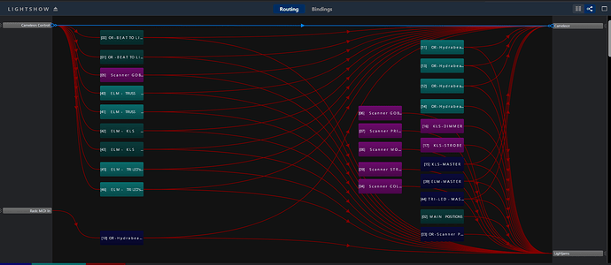
Thanks for reporting I’ll check it out.
Hi @JanM
I’ve not been able to reproduce this. Can you record a quick video showing the problem and send it to me. (Best to record with external camera/phone so can see taps etc…)
Brad
Yes yes yes! Thx Brad!
Would be great if the route lights up like the midi LEDs do, so you can see the flow.
Wow…I go away for a week and come back to find lots of new goodies in Cantabile!!! Superb feature @brad, and really nicely executed!
I like the way disabled routes appear in a dimmer colour. But one feature I’d like is to be able to see routes that exist in other song/rack states, but not the current one, perhaps with a faint dotted line or something.
I quite often have state behaviour enabled for route targets, and switch them between states, so the ability to see the entirety of connections for all states would be really useful - for example, to see when a plugin is never routed to. It would be great for tidying up complex racks that have become messy over time.
Neil
I’ve considered this and it would be cool… my only concern is the routing diagrams can be complex to draw and I’m a little concerned how this might impact performance if redrawing at a high update rate. I’m probably being a bit paranoid, but still something I need to consider.
Interesting idea. I’ll need to look into it to see how difficult that is to implement, but it makes sense. You’d probably want an option to show/hide these extra routes and I’d probably not allow editing them when they’re dotted out.
I agree, it would definitely need a show/hide option for that, to avoid clutter (on that subject, I love the Tab idea, to clean up the view!). And I agree, only routes in the current state should be editable, partly because otherwise you could be inadvertently editing routings in multiple states at once!!
Neil
Really appreciating this new feature. We all know how powerful and flexible Cantabile is, but this helps to make that power and flexibility visually meaningful.
A killer feature @brad!
I was bound to renew my license!
It’s gonna change our workflow.
Thanks.
Truly enjoyed the video, outstanding work on this addition @brad! The software engineering work is great!
Dave
Two ideas for routing Diagrams:
a)Sometimes with long rack names it would be better to have an flexible coloumn width…
b) Can you add a rightclick to add a note/memo to a route that could help not to loose overlook…
Agree. And thanks to Mitch for the work that helped to generate the idea. I hope he got an “A” on the project!
Let me think about it. Perhaps line wrapping the text would be simpler.
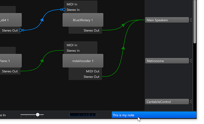
All routes and objects already have a note field:
He got a Distinction. ![]()
Brad
OMG YES! A simple feature but one of those that I was always missing even if I was not aware of it 
Working through a few of my songs, I found myself manually arranging racks in the same way across each song. I tended to arrange a “simple” song in one way, and more complex songs slightly differently.
Would it be possible to make this quicker/slicker? Ideas I have are
-
An option to set a “sticky default position” for a rack, so any time it appears in a routing diagram it appears in that position?
-
An option at a song level to save the currently showing rack positions as a “default layout”. In my case that might be “simple song layout” or “complex song layout” Then on other songs to be able to pick the layout from “simple song”, “complex song”, song specific, or auto arrange.
Any support/thoughts?
Brilliant new feature Brad, really like it.
Cheers.
Just trying this out now and loving it. Just one thing I noticed (which may be a bug or probably as intended) but the only thing (so far) I’m missing from the Routing Diagram view is that the ‘Plugin Gain’ keyboard shortcuts aren’t working e.g. I have a habit of hitting ‘Enter’ and using ‘Page Up/Down’ to quickly change the gain +3 or -3 which I find really useful. ‘Enter’ is now opening the plugin which is actually also quite nice. Not a huge issue as I can head back to the table view which is maybe the best place to manage gain/levels. But really useful to troubleshoot and to setup new songs… Amazing work @brad
Interesting idea - let me think about it. Note: this will probably be my standard response to all feedback on the routing diagrams for a bit. This is a fairly large new feature and before I rush off implementing every last suggestion I want to let it sit and simmer for a bit before collecting everything together to figure out what’s next for it. ie: love the feedback, but don’t expect immediate changes.
Thanks for reporting - there’s actually a small bug there. Pressing enter when focus is in the settings panel should open the sliders/popup, not the plugin editor. I’ll fix this for the next build.
@brad, maybe you could add the bottom item to the diagram blocks?
It would be handy to see if a plugin is active and if sound is going through it?
Or maybe just an activate/suspend button if the level meters take to much redraw cpu?
Wow!! Looks like my box of tree lights.


