I’ve finally decided (aka found time) to fix the one thing that I get more complaints about that anything else. Let me know what you think.
7 Likes
Hi @brad,
I think what you have done is great. My concern has always been more with the rack ports than with the environment ones, since I use racks a lot. Just a question: would it be possible for a rack to remember the configuration of its own ports? I am not at my PC now so I can’t check, but I seem to remember that port configuration (ordering, distance between ports) is not stored within the rack file. Am I wrong?
Cheers!
Gabriel
2 Likes
Hi @brad,
Big +1 for the wiring diagram improvements.
I would like to add a couple more suggestions.
-
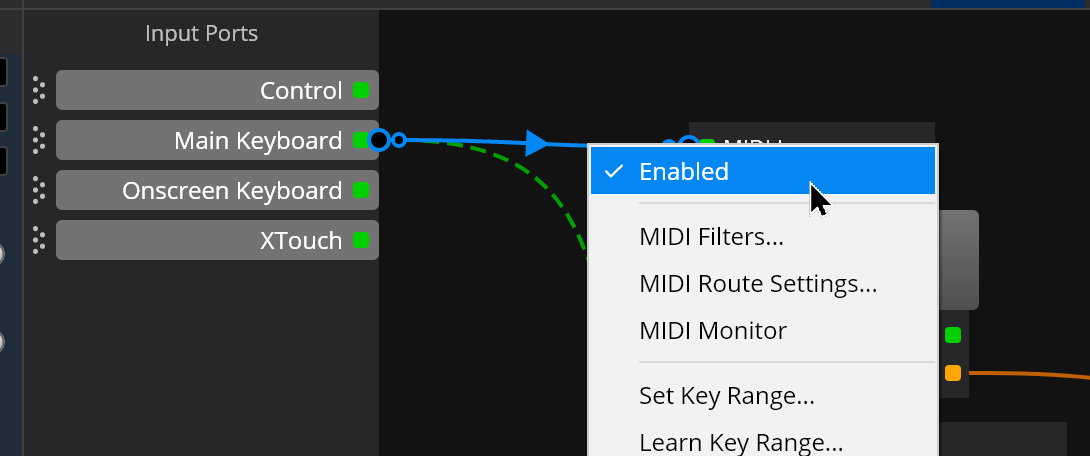
On the environment bar, add a right click on a virtual port to edit its parameters. When I was first learning Cantabile, it drove me crazy trying to remember where to find this capability. My old calcified brain finally now remembers that it is in the Tools, Options menu. You might also add a right click on an empty place on the vertical bar to bring up the create virtual port dialog.
-
I have seen this before in the forum suggestions, put the filter symbol on a route to show that a filter is active. For that matter put one everyplace that a filter is active, so that one doesn’t have to chase all around menus, racks, plugins, routes, to remember where they put them in the chain.
Thanks for all of your hard work,
John
1 Like
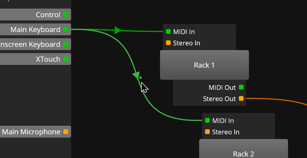
I have been happy with the wiring diagram view, although having to scroll up and down was a bit of a hassle, but I just put up with it.
But your update makes a lot of sense, and once it arrives and subsequent tidying up is done, it looks to be a very helpful update.
THANK YOU!
1 Like
@brad - my biggest gripe remains no transmission of MIDI clock when transport is stopped. Any chance of sorting that one out whilst you are on a roll 
Brad,
First of all, thanks for the work you’re putting into addressing these issues. The changes to the display of plugin state are quite welcome. However, some of what you propose in the video disturbs me.
I hope you’ll reconsider the idea of making port placement global (the idea that table view layouts in existing songs would be affected is setting off alarm bells). For me, ports are placed wherever it makes wiring the cleanest, which will depend on what plugins are used and where they are on the screen. Particularly, the idea of enforcing a grouping of rack ports vs. environment ports would not always be conducive to a clear and readable wiring view (in my opinion).
Given the original goal of alleviating the issue of ports being spread out and having to drag ports up from way down the screen to bring them up to where the plugins are, i have a few less drastic thoughts.
- Ability to select multiple ports to drag up or down (get all those Loopback ports out of the way!)
- A command to re-space (but not re-order) ports to some user-defined spacing
- A command to Auto-arrange ports leaving plugins in place (so that ports would be placed close to the plugins they connect to)
OK, a couple small changes i’d like to see:
-
I’d suggest coloring the ports with colors the same way corresponding routes are colored, i.e. red or green to distinguish MIDI ports from audio ports.
-
Reduce the margins (dead space) between plugins and the ports. It would be nice to be able to place plugins as close to the ports as desired, to better utilize available screen space.
Just my 2 cents,
– Jimbo
1 Like
AND…the storm clouds gather for the coming rain. 
2 Likes
I like this much better than the existing way. That said, if a compromise becomes necessary in order to satisfy everyone, imo the existing way is fine if the space between the ports is shrunk to the height of a port. That would suffice to get rid of all the vertical scrolling that is such a nuisance. But personally I like this new way better.
Ditto Jimbo’s comment about making the dead space between plugins and ports much smaller.
1 Like
Yes, racks remember the position of their ports.
Also noted, however I’m a little reluctant to put too many extra indicators on the wiring view for fear of it becoming too crowded. Also, wouldn’t you also want an indicator of the plugin MIDI filter - where would that go?
I’ll see if I can come up with something.
That’s a completely different area of work, so I’ve just logged it for now. I’ll need to revisit the code to remember how it works and see how hard/easy that will be to add.
No, the table view isn’t affected at all by any of this. This is strictly routing diagram layout we’re talking about.
That’s what I thought too when I originally designed this, but the feedback has been overwhelming that keeping ports in the same place is what’s wanted. Seems most people like to put ports in place and have them always be in that position.
I guess I could add a per song/rack option that controls whether to use a global layout or local layout but ugh, “options”.
Possibly, but this is the only solution I could come up with where the environment ports position is maintained without the rack ports messing things up. The only other way to do it would be for racks all save their own layout/positioning of the environment ports and we’re back to where we were before.
If I was to add an option to select local/global layout, local layout could allow intermixing.
Yes, I was thinking about this yesterday and was wondering about Ctrl+click and drag which would push other ports along instead of the one being dragging jumping over.
Good idea. Logged.
Oh ok. Interesting. Logged. Does this mean you’d also like tighter spacing between the plugins as well?
Thanks everyone for the feedback. I know routing diagrams have been pretty neglected for a while and feels good to be making some improvements in this area. No promises on any thing yet, but I’ll see what I can do to incorporate some of this.
1 Like
My error - i meant to say wiring view, not table view.
Not clear what tighter spacing between the plugins means. Currently plugins can be placed as close together as one likes - even overlapping.
Thank you !!!
Ah, I was referring to the spacing that the auto-layout uses.
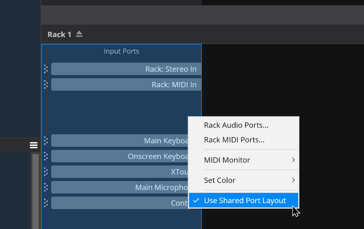
Also, rather than forcing this new layout, I’ve made it optional per song/rack. This means if most of your songs use a similar layout you can used the shared layout, but if you have an song or rack that needs something different you can detach from the shared layout and that instance can have its own layout. It’s one option per song/rack that controls both the input and output port sections.
3 Likes
+1 on that - I’d love having the option of always transmitting MIDI clock. Maybe even make this song-specific?
2 Likes
The guitar players (like me) would benefit from an option for larger font on the plugin name, so we can read them from a further distance than the keyboard people normally place their monitors. 
1 Like
Brad you’re a hero. You’ve solved the problem I had difficulty explaining to you, partly because I was on holiday in the Gambia at the time. This is fantastic. Well done.
1 Like
I’m not against this but it will mean the names will more likely to be cropped. You know you can already zoom the whole view to make it bigger? (Ctrl+mouse wheel)
Zoom only sort of helps since it enlarges ports and can truncate the needed space depending on the number of plugins. Personally I would use the rename feature to make a short name along with the large font so it’s still useful even if the actual plugin name is long.
1 Like
Hi @sekim, I’ve logged this so I don’t lose track of it.
Some more tweaks to routing diagrams:
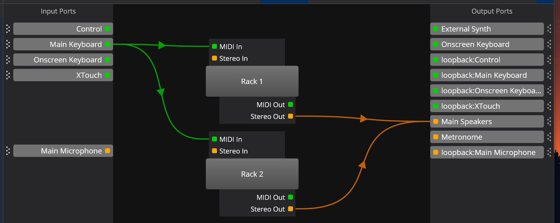
- Ports are now have a colored indicator to show their kind (audio vs MIDI)
- Green is now used for MIDI (to match the color of MIDI activity indicators)
- Orange is now used for Audio (to match the color of peaking audio level indicators)
(will be in an upcoming update)
4 Likes