Tom…@Dave Dore and I have discussed this at length and I believe @Brad has made this possible with the latest version. I use the timeline extensively to monitor where I am in a song. I don’t use a lot of state changes, but for me something simple like say 5 different colors… intro, vs. chorus, bridge and one other for alternate ending or anything of the users choice. I thought since everyone has different colored layouts, why not the ability to highlight the timeline and select a color? A marker would be ok, except for those of us who’s eyes are not what they once were, a quick glance to see a color would be better for me. Dave put together the below for me.
Addendum: I found the communication that Dave and I had and he said as of version 3602 Brad had fixed an issue with the drop-down in this proposal given to me by Dave
step 1 - Create the controller bar buttons to mark the cue points. To start the process right click on the controller bar and select “Add Button”. It will bring up a dialog box like all the ones shown below. In use you will use the first button followed by the second. Locate then mark and name the marker.
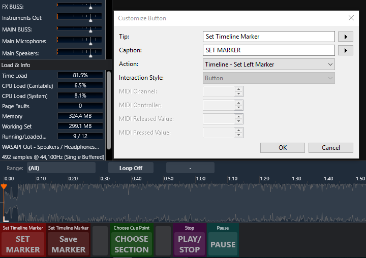
button 1 - SET MARKER - fill out the fields as shown below. This button just brings the left hand marker brace to the position you are on the timeline either from playback or dragging the play cursor.

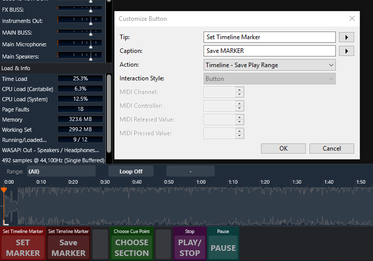
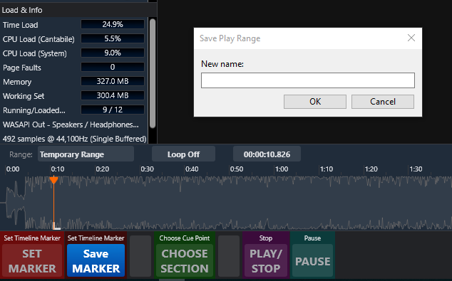
button 2 - Save MARKER - This button brings up a dialog box that allows you to name the marker. Again fill out the fields as shown.

when pressed it will bring up the naming box

when done it will be placed in the hamburger drop down menu. repeat for all cue points…
Step 2 - Create buttons to call up the markers and play back the parts. This requires the buttons to be made and some bindings added to the background rack.
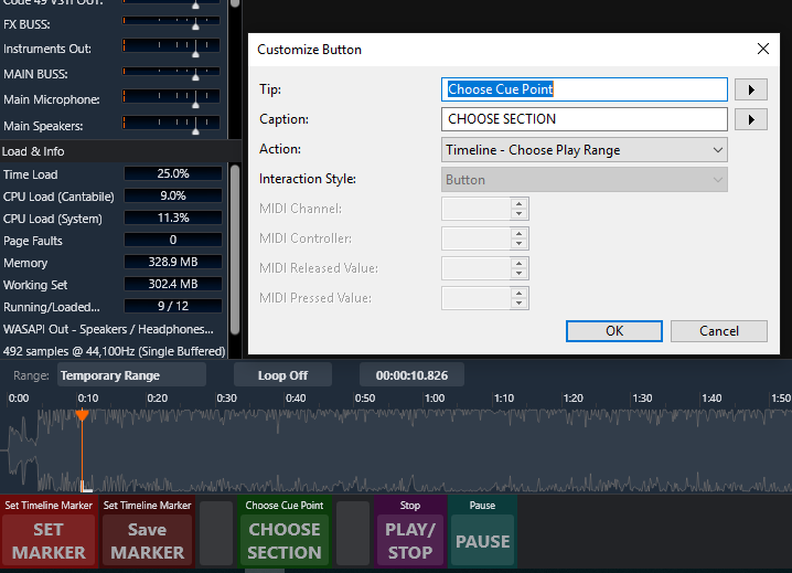
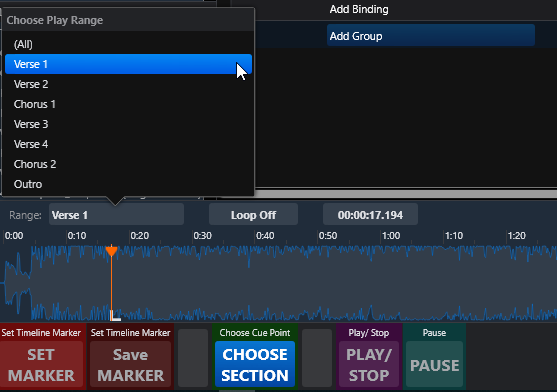
Button 3 - CHOOSE SECTION - This button opens the drop down menu with the markers but only works if you click on the time line pane before pressing it (if you were pointed to a different pane previous to using the button). When the time line pane is active the edges of the audio graphic data will have a glowing edge to indicate it is active. Again fill out the fields as shown. FWIW you can also do this move by just clicking on the Range menu box. I made the button as a extra convenience so it’s your choice as to whether you want to have it or not.

when you click this button it opens the drop down menu. Notice that the waveform has highlighted edges as I described above indicating the timeline pane is the one in focus.

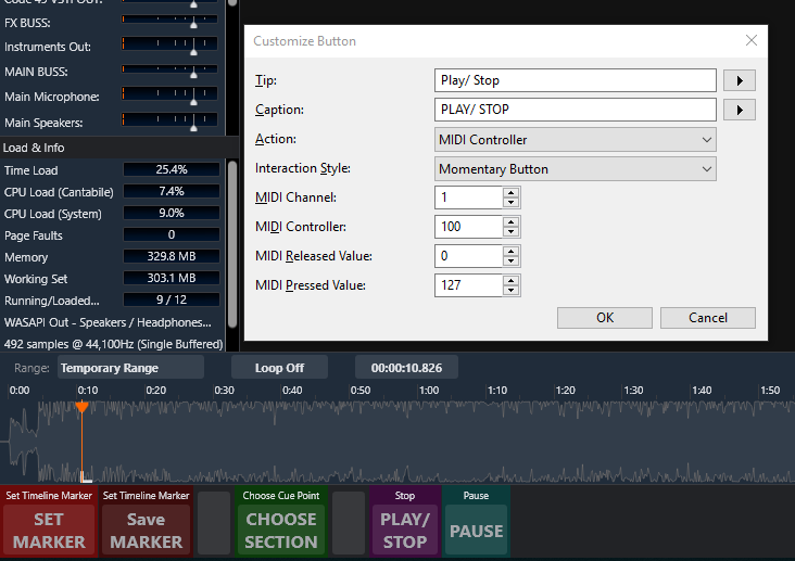
Button 4 - PLAY/STOP - just like it says. it starts playback from the currently selected marker and when pressed a second time it stops the playback and resets back to the beginning of the current marker. Once again fill out the fields as shown.

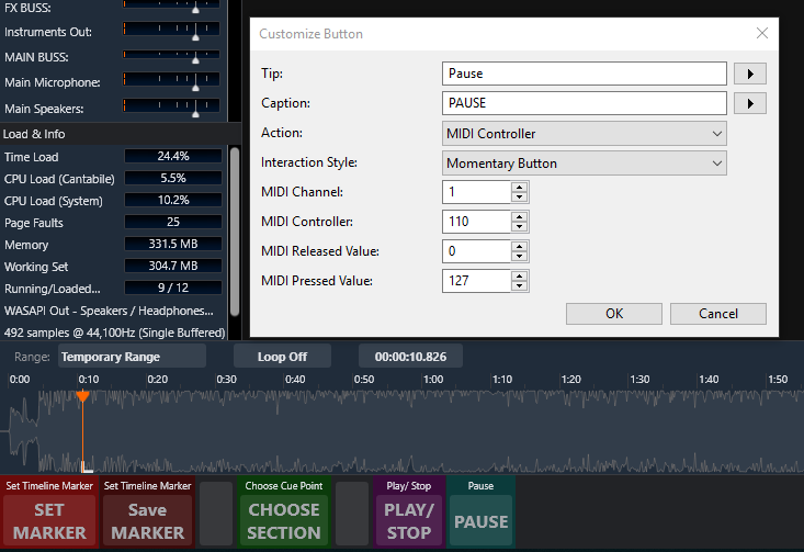
Button 5 - PAUSE - Does what is says it simply pauses the playback. Pressing the Play/Stop button will resume from that point if desired. Again fill out the fields as shown.

and the final step is to add the following 2 bindings to the Background Rack so the PLAY/STOP and PAUSE buttons will work

I think that covers it.
This was for something where I would be able to tell on the timeline where the various parts of the song we’re. As usual, Dave has done some brilliant work on this. If this works for you, feel free to use any or all of it

