Quick question. Which underline style do you prefer?
A: Most modern web browsers: (thick line, gaps over descenders)
B: Microsoft Word: (thinner line, no gaps)

Personally, I’m leaning towards A, but perhaps with a finer line like B.
Quick question. Which underline style do you prefer?
A: Most modern web browsers: (thick line, gaps over descenders)
B: Microsoft Word: (thinner line, no gaps)
Personally, I’m leaning towards A, but perhaps with a finer line like B.
Style A with the B line for me! Can I have fries with that?
I think I like B better. For some reason, the A style feels unnatural ( probably the curmudgeon in me ). I can live with either very well, and am looking forward to this.
Prefer B, but either is fine.
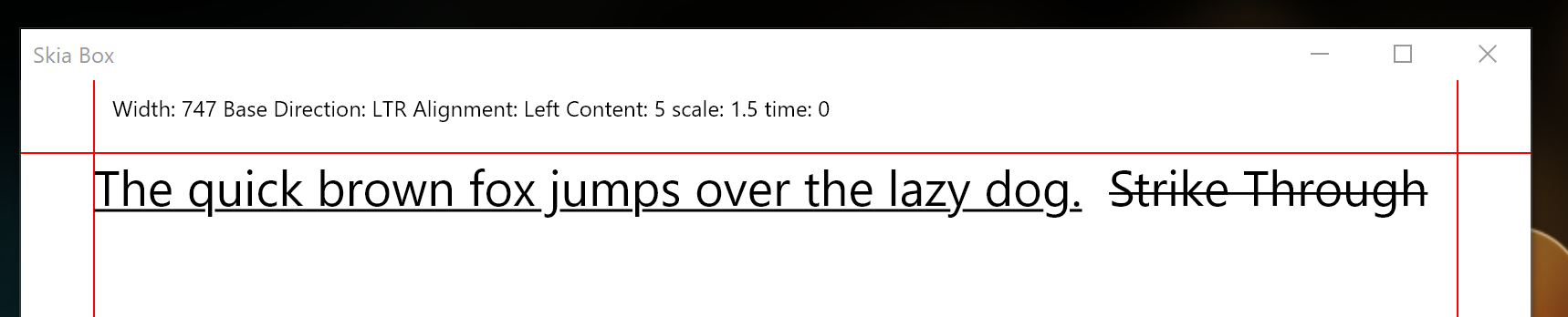
The above screen shots of the underline probably weren’t ideal because they were a bold font and the underline may have been too heavy in the first one.
Anyway, underline and strike through now working and I’ve gone with the following:
Works for me… 
It all looks good…
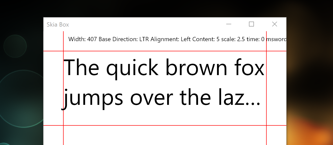
More testing, bug fixing and code clean up today. Plus, ellipsis truncation now working:
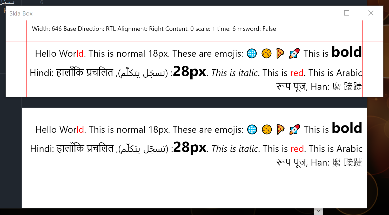
Also, comparing GuiKit (top) to Chrome/Opera (bottom) for RTL layout and general text positioning. I’m shocked it’s so similar (ie: I can’t spot any differences)
Thin line for sure!
It’s more readable
Some questions.

Yep, it will. This is just a test harness/sandbox program while I develop the text layout. Integration into Cantabile will come later… and will incorporate theming at that point.
Probably. That’s the next higher layer which I haven’t given too much thought to yet. The current work is just the in-paragraph formatting/layout.
Some, but the point is to support correct Unicode layout and formatting… and that encompasses many languages and scripts.
And a host really cool symbols I would love to use!! This is huge step in the area of appearance …
Dave
True, it will make c3 so much better and user-friendly.
Notes/live view is the main window in live situations so you need to be able to have a flexible environnement.
Also in rehearsal situations you need to be able to make quick edits.
Another quick progress update. The last few days have been mostly spent on code clean up, and a bunch of related utility functions I’ll need in order to integrate this into Cantabile.
Left/centered and right aligned text is now supported: (note this is different to left-to-right vs right-to-left text layout). Also, in-paragraph soft line breaks are now working:
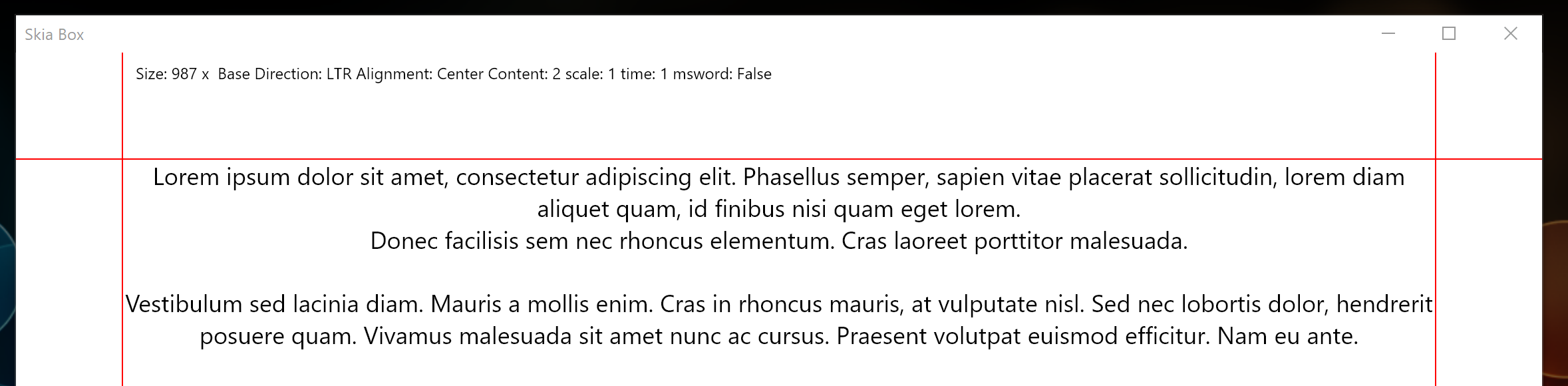
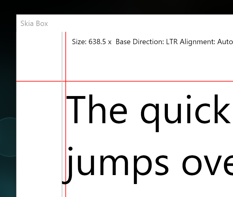
Non-width constrained layout is supported as well as layout measurement features (green highlight shows the calculated measured size of the text).
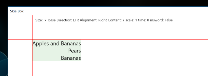
Also, left margin over hang measurements (the grey line shows the calculated overhang measurement):
Next up, I might integrate this into Cantabile as is. This wouldn’t give any new features - it would just make it work better. ie: font fallback, emoji’s, bidirectional text would all start working but there wouldn’t be any new formatting options.
Looking a little further ahead there’s two routes I’m considering for show notes:
Updating the existing show notes feature to allow the use of Markdown. This would provide new formatting features but still cumbersome to edit.
Implement a full wysiwyg editor for show notes - ie: ability to type directly in the show notes window and probably a toolbar for formatting options - a mini word processor if you like. This approach would also require a complete reworking of how notes integrate with states.
Option 1 would be relatively easy to implement but would also make moving to Option 2 harder. Option 2 is a fair bit more work, but I think this is where this needs to go eventually.
As we’re not all programmers, it’s clear you eventually need to move to a wysywig editor. I sure have the patience to wait for it. ![]()
Also, will this be an extra add on to the notes or will the existing notes still be working?
Totally agree option 2 is the goal …
Dave
I’m not sure yet. Initial thoughts were to build a completely new framework for notes, with a way to manually “upgrade” old notes to the new system when you’re ready. I was thinking of having both systems run in parallel for while.
Thinking about it more though over the last few days and I’m now leaning towards keeping the existing show notes and just embellish them.
In other words… I don’t know yet. ![]()
More progress… I decided that while I had all this rich text stuff fresh in my head it would be good to finish of a set of features that will be necessary to build a wysiwyg editor.
Primarily this involves:
Seems to be working well. It’s still a long way from a working editor, but here’s a quick video of me testing it. The pinkish red highlighted character is the character the mouse is over, the vertical bar caret is where the caret would be moved to if the user clicked at the that position.

Couldn’t imagine an editor took so much work.
Seems all that simple in my head
Love the fact that you can zoom the text!
I also think the A style is better for read.
I agree with the option 2 with its time work ![]()
In the meantime, great job with the wysiwyg editor, until now, perfect result.