As might already know, GuiKit, the user-interface library that Cantabile is built on, is also used in my son Mitch’s game Sector’s Edge. One feature that I added for him quite a while ago was a full-screen mode.
I’ve been meaning to make this available in Cantabile for a while now but the problem has always been the menu bar. Windows doesn’t really provide a way to have full screen windows with the standard menu bar - you can have it stuck to the top of the screen, but that’s not really full screen and looks a little weird with a bright white bar across the top of the screen.
I could remove it for a nicer look, but then all those commands would be inaccessible while in full-screen mode. So over the last couple of weeks I’ve been playing around with a custom menu bar implementation and it’s getting close…
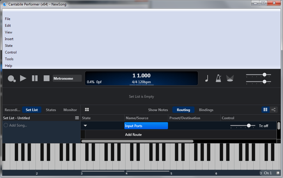
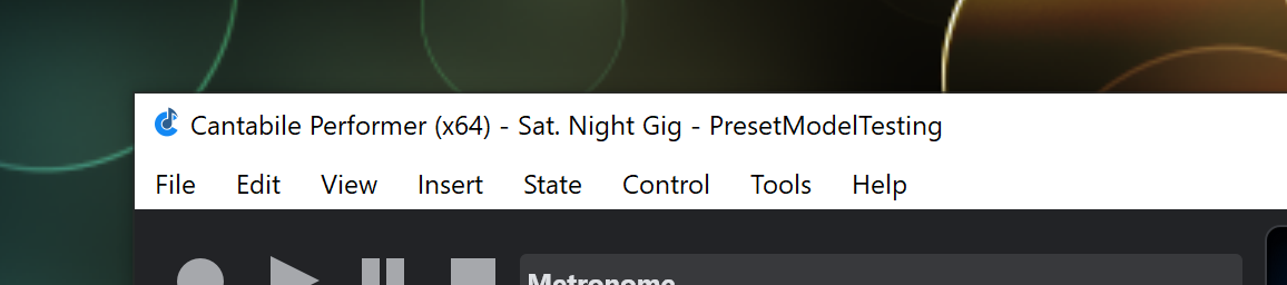
First of all, I’ve made the menu items a little bigger for easier access on touch screens. Here’s the old menu bar:
I then went to great lengths to get it working as closely to the system menu bar as possible:
Same colors and background highlights
Same keyboard navigation behaviour
Automatical showing of shortcut key underlines when Alt key pressed
A thousand other little details that no one ever thinks about but all contribute to the experience.
Now with a menu bar that I had some control over, I could make it disappear when in full screen mode but still have it accessible. The menu bar automatically pops up when:
Pressing and releasing Alt key, or pressing Alt+(menu letter)
Moving the mouse to the very top of the screen
Swiping down from the top of the screen on touch screen devices.
Seeing as I got all that working today, I thought I might as well integrate it into Cantabile and give it a test drive:
New menu command View → Full Screen
Default short cut key of Shift+F11
Live mode vs standard mode now remembers if you were in full screen mode.
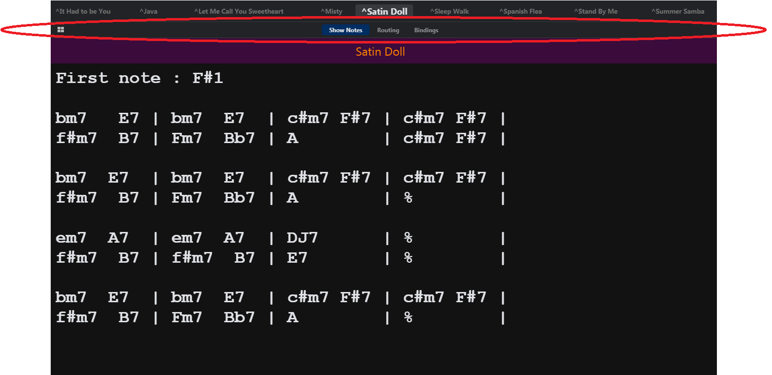
Needs a lot more testing and not sure when it’ll ship it, but it’s looking promising:
What? wow
Pity we loose valuable screenspace with the menu bar.
Isn’t it possible in a ||| hamburgeeeuurrr menu?
For example in the Savihost I can choose to show or hide the menu, and rightclick for access to the menu.
So a hamburger menu on the right top would make it accessible for touch users.
Also, in this case, I think a split in the notes menu would be very handy, to have 2 columns of notes so we don’t need to scroll down.
I see one downside in the fullscreen LIVE modus,
I cannot see the output levels and the title bar (without loosing space), so I added this plugin. But it overlaps the notes and title bar.
Why do you lose screen space - the menu bar disappears when not in use. Or, am I misunderstanding something?
Yeah I’ve had a couple of requests for things like this - I’ll consider this as part of the show notes rewrite.
Well now the title bar and the menu bar will be gone so won’t that give you enough room now? Also don’t forget that full screen mode removes the Windows system tray so you get more room that way too.
As mentioned above - for touch screen you can swipe down from top edge of screen to show the menu bar.
Yeah true, i win some space, and it would compensate with the menu and bar i think, but what’s the point in winning when you loose some again… Maybe it could be an option to keep on showing the levels in the right Songtitle ticker? Afterall we don’t need the whole width of the screen for that ?
Or maybe have a small horizontal ticker bar that shows all the in and output levels (without the gain controls?)
PS: IMO we could win some space if the gain control button was on the gainmeter, instead of next to?
Here’s a bug I’m seeing with the new menu. The menu items are stacked vertically after minimizing the app and then bringing it back in focus. It goes back to normal if the window is moved, resized, or regains focus after another app has the focus. This is on a Win7 machine.
On a related issue of maximizing usable space, is there any way to hide the (redundant) Main Panel selection bar, or does that need to be another feature request ?


 so we don’t need to scroll down.