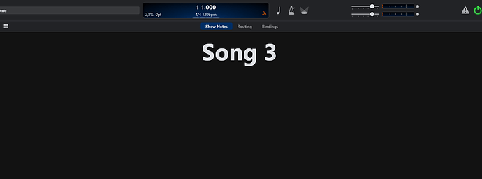
I use dedicated buttons on my midi controller to switch between the views. So this could free up the screen (a bit).
I would like to hide it in Live Mode to maximize the display space - in editing mode, it is useful.
Cheers,
Torsten
Thanks for feedback guys… leave it with me.
Really enjoying full screen mode! Extra screen space, and the removal of a brightly-coloured distraction.
It’s amazing what a difference such a small change can make.
Neil
Next build will have some more changes in this area:
- You can now hide the tab bar on the song rack panel. You can’t hide the equivalent tabs on a rack view. Note that with the tab bar hidden you can still switch tabs via Ctrl+Tab and Ctrl+Shift+Tab
- You can now hide or show the menu bar in both full screen and non-full screen mode
- When the menu is shown in full screen mode it loses the system styling and matches the selected Cantabile theme (ie: dark or light).
- When the menu is hidden in non-full screen mode it can only be activated via the keyboard.
Already very good and getting even better. I tried it out today and it really does make a difference!
Dave
Build 3604 is up now with these most recent changes.
Looks great!
And what is the idea behind not showing the tab bar on song level but on rack level?
Primarily for simplicity to save having two commands. I considered using the one command to hide both sets of tabs, but then you lose the “eject” button to get out of a rack. Also since this seems to be primarily about real estate while performing and most people will only really needs this on the song page (probably to give room for show notes), this seemed like a reasonable compromise. Happy to be told otherwise though.
ok maybe looking forward to the next release, this version is not what I’m looking for. But still a small improvement  Thx Brad.
I may be - and probably am - a simpleton but I would really appreciate it if the song name appeared somewhere in full screen mode.
Just a thought 
Pretty easy in the typical full screen scenario (displaying show notes): simply create one show note with $(SongTitle) as its content - now you can display the song title in any size and any color…
Thanks for the idea. But it’s one extra click to have to do for something which is automatically there in normal screen mode. I prefer to keep my eyes on the Routing (meters/signalling) action at all times.
It just mystified me…and then I couldn’t get rid of the ticker bar  Gone back to 3598.
Thanks for the suggestions.
I did consider this but figured that there are a multitude of other places where the current song name is displayed:
- The set list panel
- The set list grid
- The ticker bar
- The controller bar
- Possibly in show notes (as per @Torsten’s suggestion above)
…and figured most users would be using at least one of these. I could display it to the right of the menu but then you’d need to have the menu enabled in full screen mode too.
I don’t think going back to 3598 will help you much with any of the above. It’ll just remove features in newer builds that you don’t have to use anyway.
You can get rid of the ticker bar thse same way as any other focusable bars and panels: activate it and then press Shift+Escape, or choose View → Hide Active Bar/Panel.
To get rid of the ticker bar, click anywhere on it, then hit Shift-Esc - should be gone. No need to go back to old versions for that.
“I could display it to the right of the menu but then you’d need to have the menu enabled in full screen mode too”.
Yes please do that. That would be great…just what I need for the way I work 
I did work out the way to remove ticker bar in the way you mention. (Just unticking it in the View menu would seem more logical though).
The main reason I reverted to 3598 was because I was getting audio glitches that seemed to be related to using full screen mode. Could that be because I use DeskSoft’s WindowManager to place windows on the 2nd monitor and it also controls size, position and state. There might be an argument taking place there…?
Thanks Torsten! 


