I’m sharing some recently-developed resources that help with an over-crowded Controller Bar. There is an attached package containing 30 fonts in 5 widths (Normal through Ultra-Narrow) and 3 weights (Normal, Semi-Bold, Bold). I am also including my Theme files as an example of how to set up a custom Cantabile theme.
The related post is:
After Brad assisted with the issues in that post, I was able to forge ahead and build fonts and themes that work nicely for my crowded Controller Bar setup.
Layouts
I currently have themes for three Controller Bar layouts on two different hosts: Husky, a desktop with 3840 pixel wide screens and Atlas, a performance laptop with 1920 pixel wide screens.
The one Husky layout looks like this:
- Titles: 17pt Kurinto Sans Core Nar (Narrow)
- Button text: 24pt Kurinto Sans Core ENar SmBd (Extra-Narrow Semi-Bold)
The two Atlas (laptop) layouts have different amounts of info and use different fonts:

- Titles: 13pt Kurinto Sans Core Nar (Narrow)
- Button text: 18pt Kurinto Sans Core Nar SmBd (Narrow Semi-Bold)

- Titles: 16pt Kurinto Sans Core Nar (Narrow)
- Button text: 22pt Kurinto Sans Core ENar SmBd (Extra-Narrow Semi-Bold)
The Fonts
The set of fonts is from my www.Kurinto.com font project that I distribute under the OFL 1.1 open-source license. Here’s a snapshot of the fonts in the ZIP package:
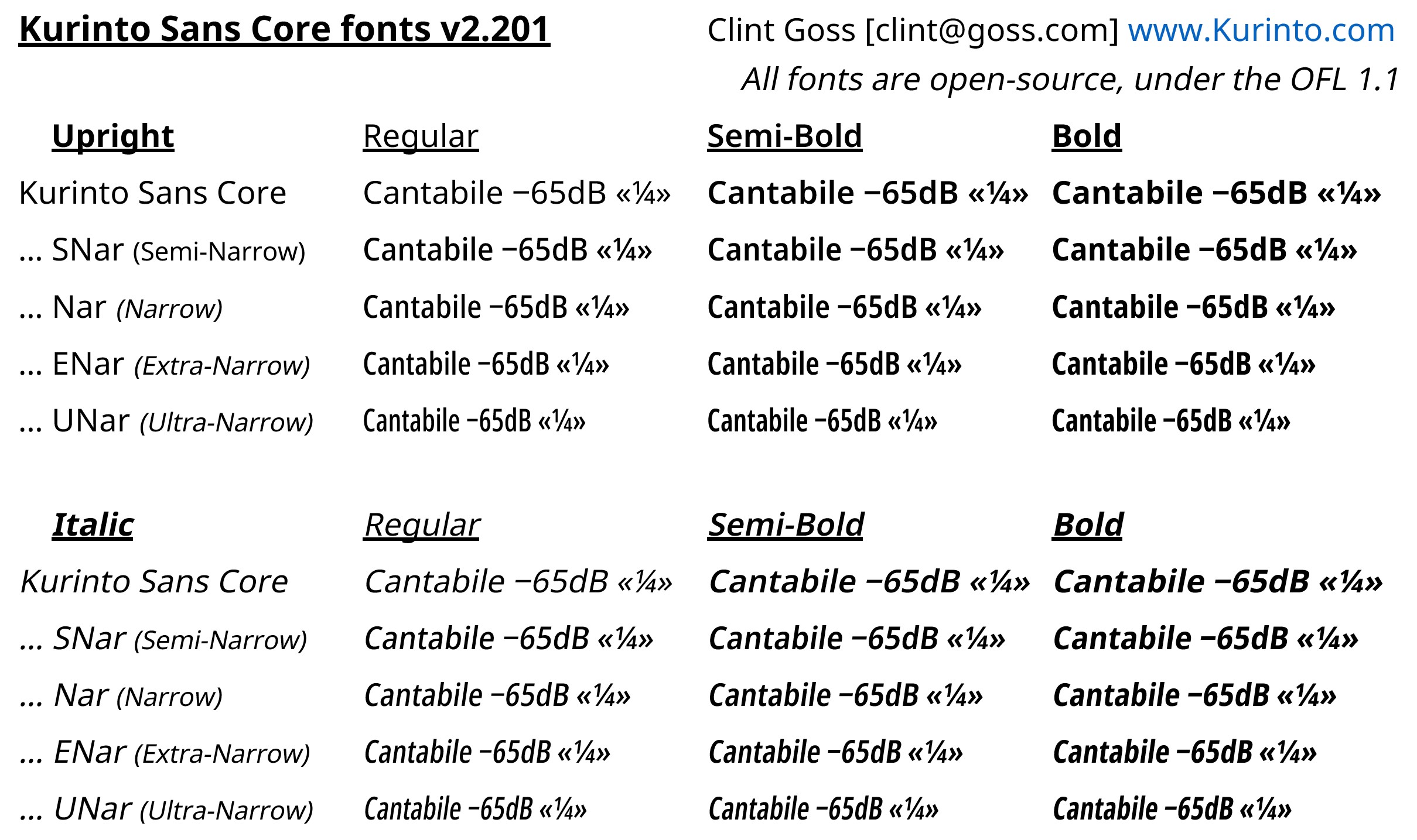
These fonts are carefully designed to be readable on screen at relatively small sizes and compressed widths.
Note that I am using the Figure Dash character (Unicode U+2012) rather than the default ASCII Hyphen-Minus (U+002D). Figure Dash is much wider and somewhat higher, to line up properly with digits (the Hyphen-Minus has to work with lower case letters and it much lower). Another possibility would be the dedicated Minus Sign (U+2212). However, the Figure Dash does take up some horizontal real estate.
The Italic fonts are really slanted (Oblique) versions of the upright fonts – a general design principle throughout the Kurinto fonts.
At this point, I am tending towards the Semi-Bold weight for the data on the Controller Bar … it seems a good balance between visibility and not getting “clogged up” on-screen.
Themes
Each of the themes included in the ZIP package contains a single main.gtl text file that can be edited. Each of those files has examples of how to access all the fonts included in the ZIP package.
Some things to note:
-
Fonts will need to be installed on your system to work. C4 is not (yet) able to load font files on the fly from the theme package or resource directory.
-
I am currently unable to load a theme from my local Resources folder (the one declared in Options → File Locations → Resource Folder). The Theme does appear in the selection list, but then when it is selected, Cantabile cannot find the Theme. This appears to be a bug as of v4062, reported here:
Controller Visual Feedback - #9 by ClintGoss
I’ve solved this issue by establishing a Junction from the Cantabile install location (typically /Program Files/Topten Software/ Cantabile 4.0) into my Resource folder for each of the themes (a bit messy, but it works for now). -
Due to arcane font naming issues, the naming of the fonts is a bit funky. Semi-Bold fonts are named somewhat differently than the Normal and Bold weight fonts. Use the examples in the main.gtl files as guidelines.
ControllerBarFonts_2023_0426a.zip (3.5 MB)
