Another diagram / graph view fan here! I use it 100% of the time, never used the table one 
My stuff is mostly too complex for the Diagram view - happy with list view.
Never used
One might imagine that Wiring View would help with visualising complex rigs, which it doesn’t seem to according to those us here - and would be overkill for simple rigs, which also seems not to be the case.
Interesting…
I am getting the drift that the new version of the wiring diagram that utilizes the GUIkit foundation is going to be even more interesting! 
Terry
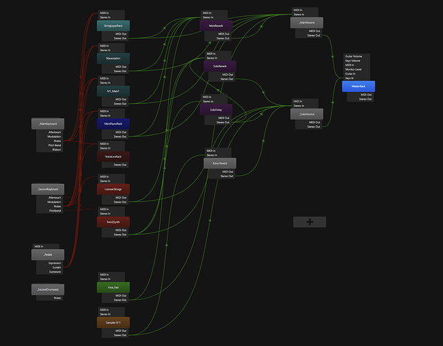
Just to illustrate the above - here is a typical song setup from my setlist:
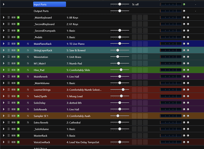
In list view, this looks much more manageable:
It also gives me much more of the relevant information:
- selected rack state
- gain level
- current signal level (useful: is there a signal or not?)
My routing is usually pretty much the same: from input racks to the various instrument racks, then from instruments to main or solo volume, with sends to main or solo reverb / delay. So I tend to fiddle mostly around the specific sounds within the racks and with the respective levels between racks, which I set with rack gain.
The layout is logical, mostly top-down from input racks to all sounds on my main keyboard (including delay / reverb, then solo for my upper keyboard, finally everything goes from the respective volume controls (_MainVolume, _SoloVolume) into the master rack, and VoiceLive control is at the end (just patch selection).
Routing is already pre-set in my standard template songs, and I set it up early in the construction of a new song - then it’s all fine-tuning of levels.
But I’d definitely be lost without colors ![]()
Cheers,
Torsten
My rigs typically look much like yours, Torsten.
And +1 to colours!
Like everything with this tech update, the immediate goal is just cleaning up and refactoring the code while matching the existing functionality. But, that should serve as a good base for future improvements.
Hi,
I know it’s probably a matter of personal taste - but I really like the wiring diagram, I don’t use the list view at all 
I have a setup similar to Torsten’s, where sometimes I may add an arpeggiator and/or midi transformations
Luigi
Wiring view is what was default for me when I started using Cantabile a month ago.
I use it to make an initial setup then switch to the table view.
When I was a new user I found Wiring View very helpful in getting my head around what Cantabile does and how it does it. Table View made sense immediately when I looked after setting things up in Wiring View. So for that reason alone I feel it has a lot of value since many people probably have a similar experience when new to Cantabile. That said, I still like it for the electric guitar use case since it is analogous to a pedal board (on steroids  ).
).
Yes 100%, the diagram view gives a better sense of flow

