Hey guys,
I’m curious, which do you prefer:
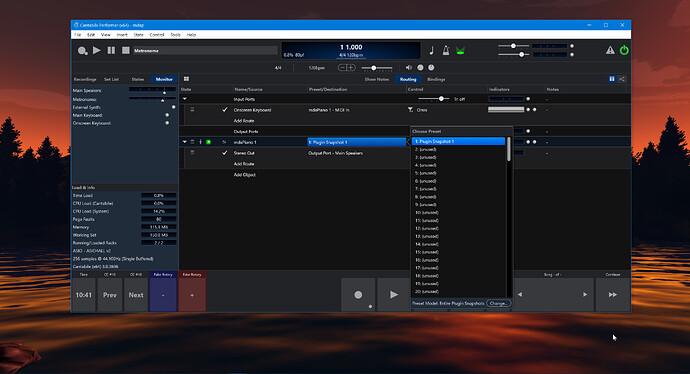
A) The preset popup picker in the current release of Cantabile:
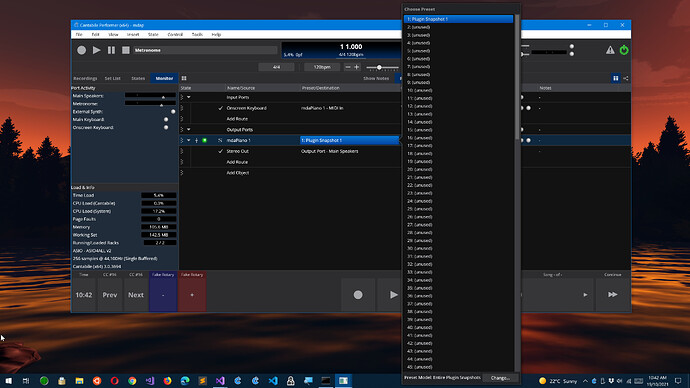
B) Or this, which I accidentally built in the new version where it expands to be as large as possible for screen size:
(to be clear, if the popup only has a couple of options, it’s not stretched to full screen - this is only when the menu has a lot of items)
- A) The classic, smaller popup
- B) The larger, full screen popup
0
voters

