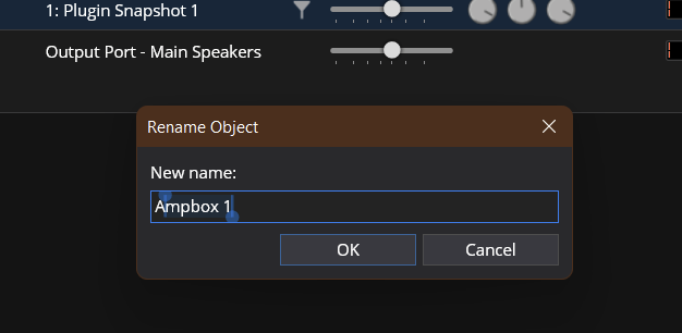
Guess this is one for @brad: when I select text in edit boxes on my “Live Cube”, it gets selected with “handles”:

which is really difficult to see and handle and causes a lot of mess-ups for me when editing…
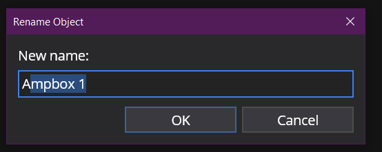
All my other systems (Win 10 and Win 11) show selections the traditional way:

which is also a bit difficult to see in dark mode (the blue could be a bit brighter so selections are clearer), but more what I’d expect and less error-prone.
I assume this is because my LiveCube has a touch screen attached? But since I never do text editing on a touch screen using my fat fingers, this is completely useless to me, so I’d love to be able to turn this off and have “normal” text selection.
And if I could get a selection color with better contrast, I’d appreciate that even more ![]() . I suspect I could even set that somewhere in the themes files - maybe someone can point me in the right direction?
. I suspect I could even set that somewhere in the themes files - maybe someone can point me in the right direction?
Cheers,
Torsten
 ).
).