Hey Guys,
Interested in what you think about this before I make a build with it…
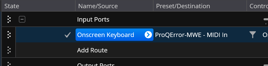
Here’s how colored set list and state items look:
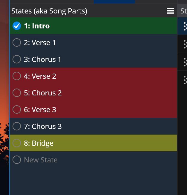
But when they’re selected you can’t see the colors. This is particularly annoying when setting list item colors because you can’t see the change until you select something else.
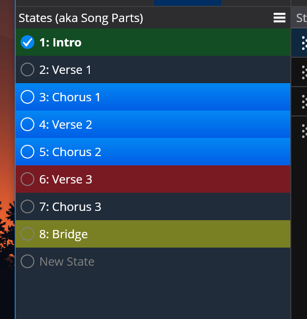
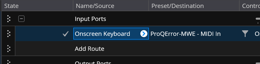
So, I thought I’d match the style used in the wiring view where there’s just a blue outline around the selected items.
But, I think that looks pretty messy - especially the double width line between each item so I got rid of them:
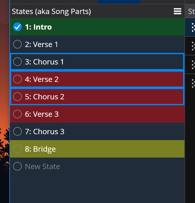
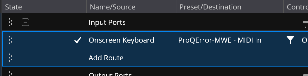
But now there’s different selection styles in the main table area (and many other places)

So I’ve switched them all to that to a similar style:

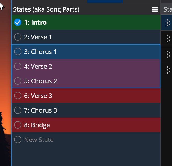
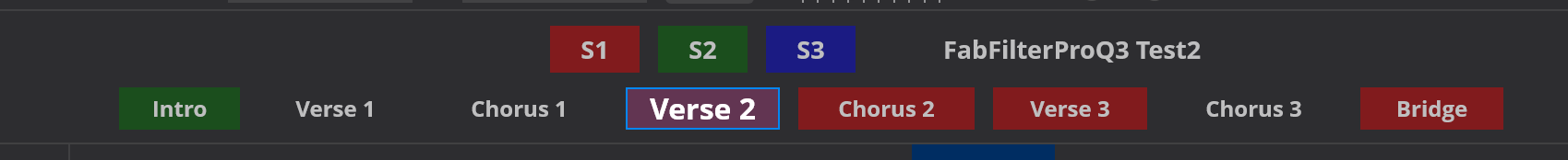
Along with all this, I’ve also updated the ticker bar to show song and state colors and similar selection styles:
Personally, I think it looks much cleaner, but interested in feedback before committing to it.
Brad