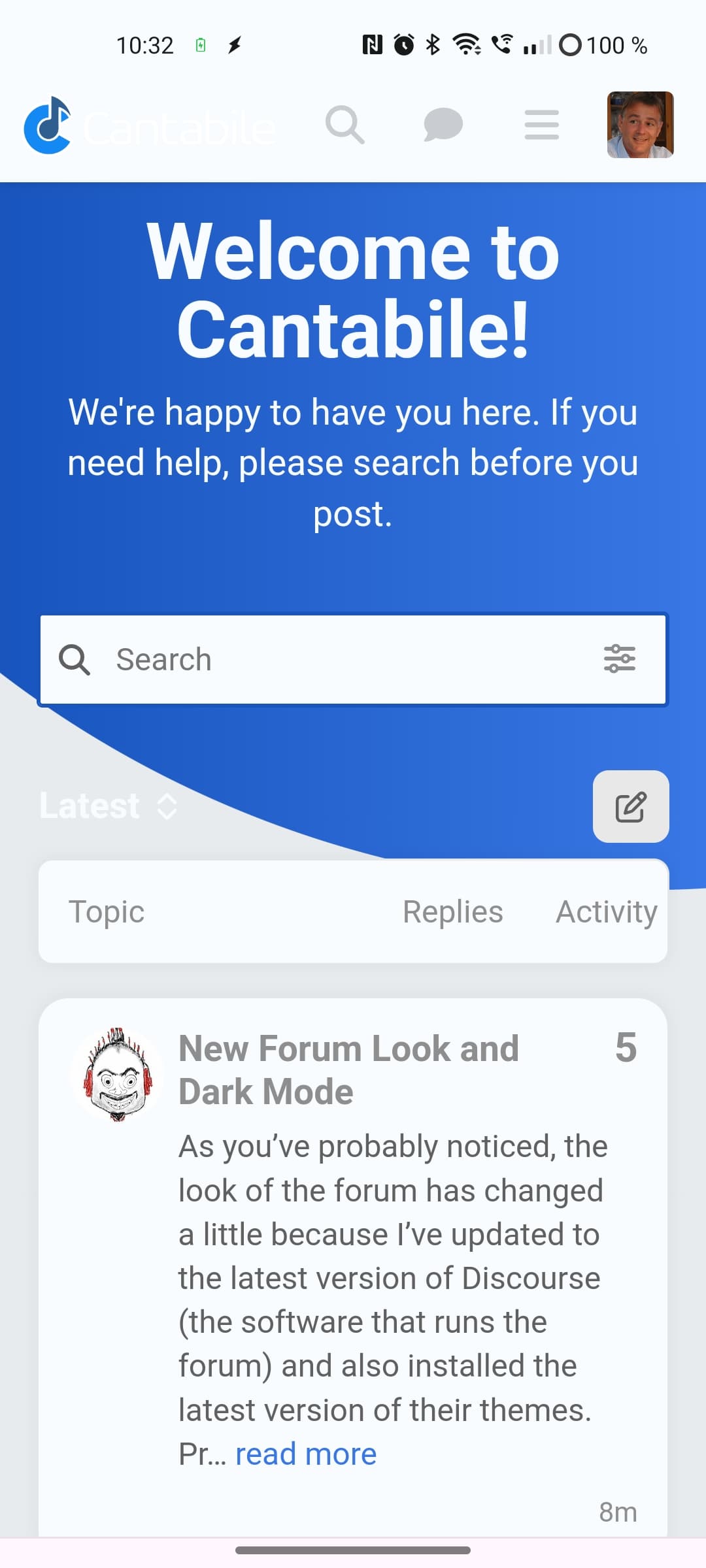
As you’ve probably noticed, the look of the forum has changed a little because I’ve updated to the latest version of Discourse (the software that runs the forum) and also installed the latest version of their themes. Primarily this is to support dark mode.
I’m not sure I like the new look, but perhaps just because it’s different and I’m not used to it. Curious for feedback on this.
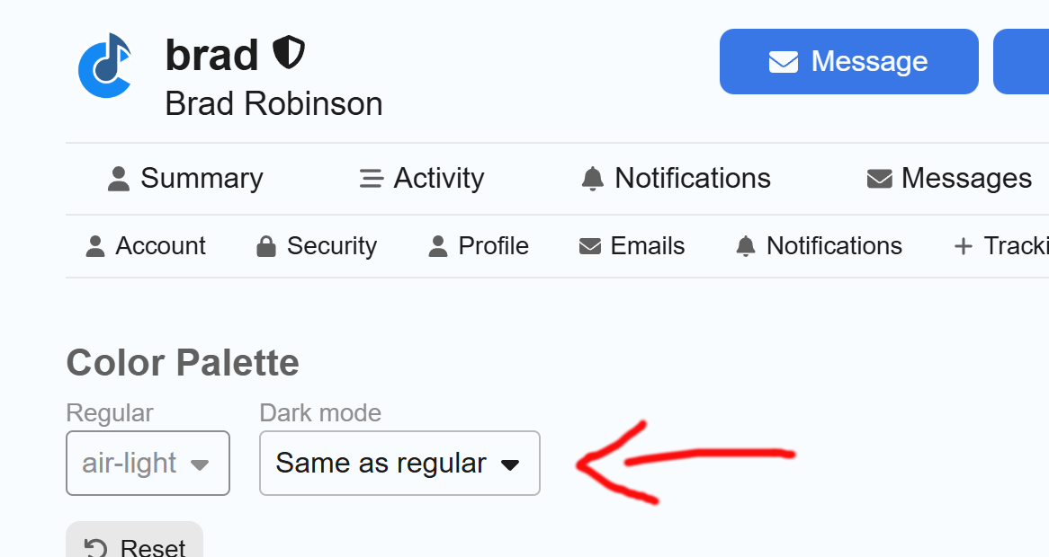
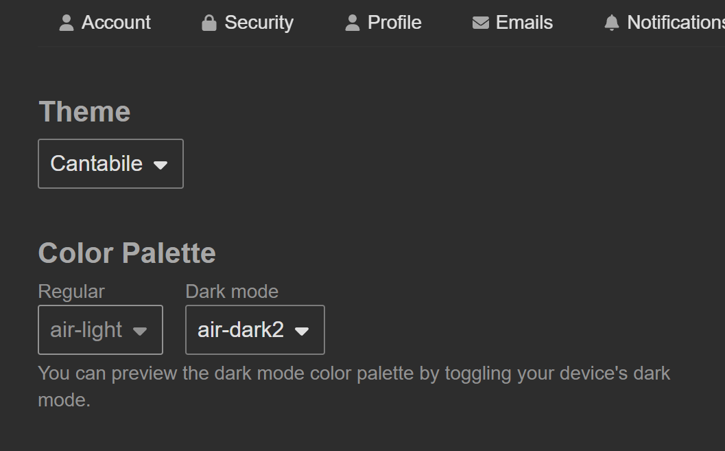
Anyway, to enable dark mode you need to go here and choose “air-dark” or “air-dark2” for the Dark Mode theme, then scroll to the bottom and click save.
Note: air-dark2 swaps out the purple colour for blue
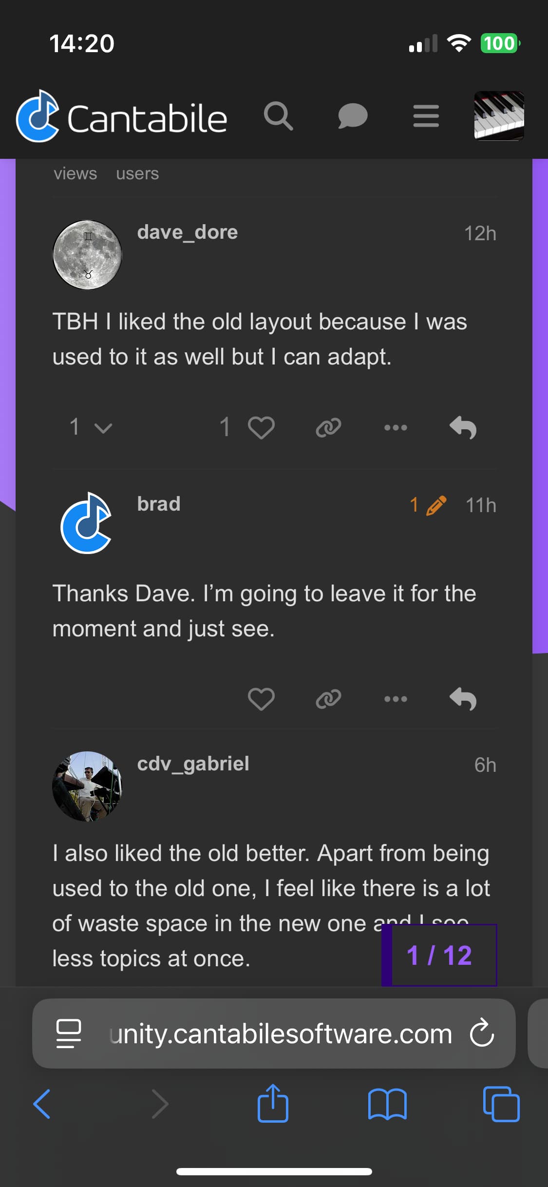
I also liked the old better. Apart from being used to the old one, I feel like there is a lot of waste space in the new one and I see less topics at once.
hmm, not at all convinced of the new layout. It’s ok’ish on a large screen, somewhat readable on a tablet in landscape mode, but pretty much useless on a mobile phone, where I do a lot of forum browsing. On the phone, I now just get to see 2 (sometimes 3) threads, since they display such a lot of first post content (which I don’t need once the first post has been read and the discussion takes place further down) and padding.
I’d much prefer going back to the old layout - I don’t see a lot of benefit in the new one, and a lot of downside. It completely loses the optical overview and requires endless scrolling on mobile phones. With the old one, I could see at a glance what was new, even on the phone.
please (if possible) at least make the new layout optional…
more than half of the screen filled with non-content, and then one post…
Also, I don’t like the inconsistency: The post shown was created by @brad, and the content displayed is also Brad’s, but the icon on the left is @Clap, who posted the last reply - but it’s not the reply that is shown on screen. Not really good UX design…
Funny indeed…
Maybe that the algorithm relies on the last post, instead of the content creator?
AI-based perhaps?
Because it is well known that AI is delirious, quite often
I’m scrolling and scrolling to see what’s going. I agree with Torsten with regards to lots of unused space. Previous format was more compact and information dense at a single glance.
Have to agree, that inconsistency between the post text and profile pic isn’t great.
Also, the spacing and rounded borders on the home page make it feel a bit bulky.
It’s some AI based. I get : “An error occurred: Body seems unclear, is it a complete sentence?” when I try to send “Naaaaaaaaaaaah” as a whole message.
But it’d be better if it was more compact. Maybe it’s just a matter of getting used to it.
On Safari (iphone) it’s fine just in case, I usually see the Forum on PC/Mac or iPad 13".
I go with dark for most software, especially on my phone. Agree the more compact display with more topics in one view is preferred - is there a way to keep the new features but tighten up the spacing? As day job is IT, I’m constantly buffeted by UX changes so pretty good at adjusting to changes like this.
EDIT1: Just did my usual look at new posts on the computer and I’m fine with the less compact layout. Will check on my phone and report back
EDIT2: How do you switch the Mobile to Dark2 look?
Love the dark, the larger text, and the zoom feature. I think I could get used to it. I had to go to Fire Fox for my Win 8.1 Laptop to see this. This will eventually happen to Win 10, as technology speeds on. Thank you Lord Microsoft…you are my eyes, my ears, and my bank account.
It goes dark on its own after logon. I think it is because of my forum setting, always dark.
I have tried Firefox and Safari on iOS, Chrome on Android not yet.