Anyone else seen this? When the controller bar is this small the width of the border takes up nearly half of the bar’s height. Something I’m missing?

Anyone else seen this? When the controller bar is this small the width of the border takes up nearly half of the bar’s height. Something I’m missing?
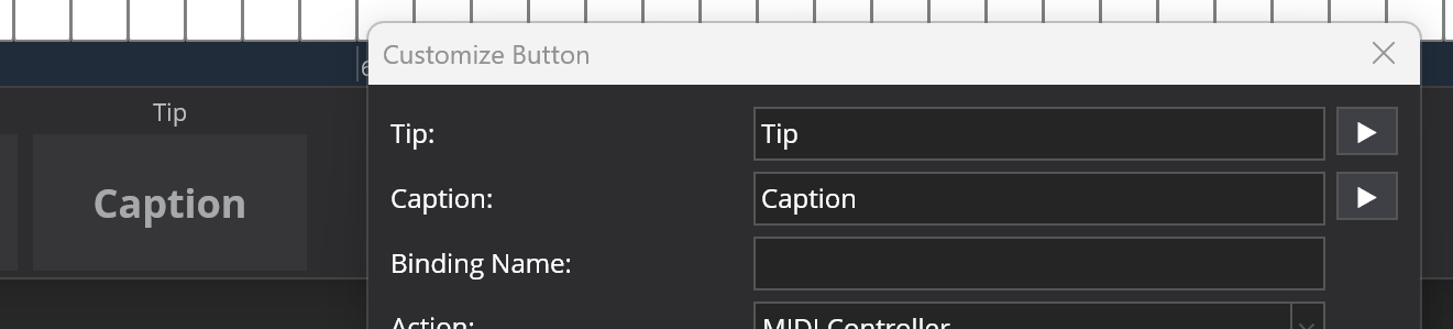
As far as I know the Tip field height at the top of the button is fixed so that the text will always be seen when you decrease the height of the button. So it’s not scalable vertically because the font sizes are fixed as well. The same applies to the text in the Caption field.
Hi @brad, on the assumption I’m not missing something, could you take a look at some point. What I didn’t mention was that I’m using a touchscreen, so maximising the area of buttons is of interest. Thanks.
The buttons in the controller bar have two pieces of text - a tip and caption:
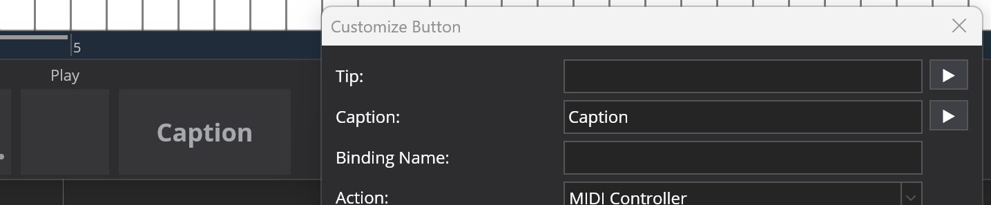
If the tip is left blank, the room for it is left so that everything lines up.
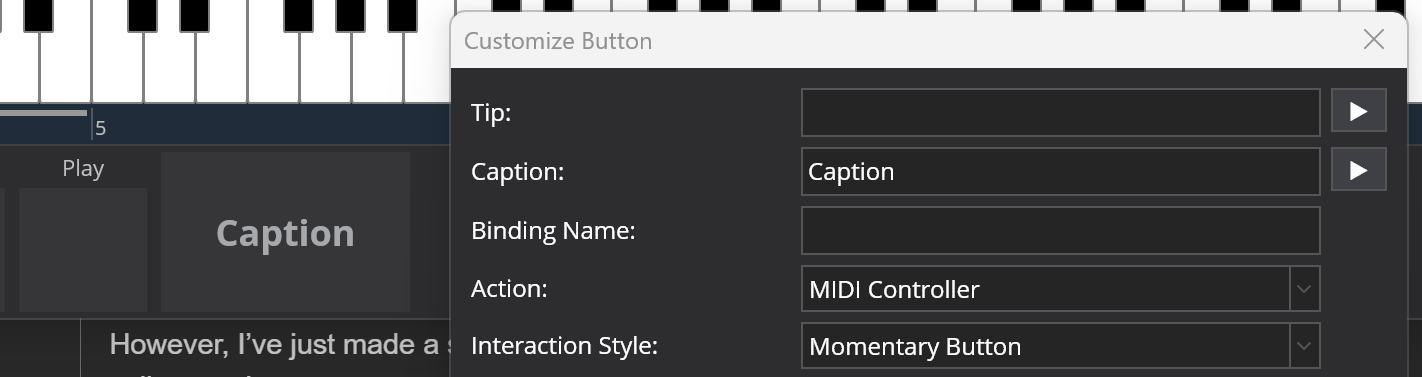
However, I’ve just made a small tweak that will be in the next build. If you leave the tip blank, it collapses the room reserved for it and expands the main button:
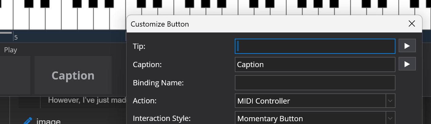
If you want it to reserve the space so things line up, you can put a space in the tip:
This change will be in the next build.
Thanks!
This change is available now in experimental build 4329.