Great to see work on this feature going ahead! A few things I’m not keen on :
-
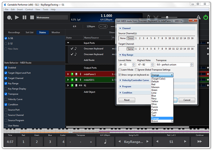
It means that in order to benefit from the key range indicators we need to use rack colour, which we might need for other uses (eg distinguishing effects/instrument racks, indicating which racks route to which stereo output pair, etc).
-
It means that in order to benefit from the key range indicators we must use the onscreen keyboard, which takes up valuable screen space, particularly in live mode.
-
It means we need to visually cross-reference using colours when setting up zones. Look at the on screen keyboard, see the zone is red, so look to see which rack is red, then look to see what route maps to that rack, then you an finally edit the range…
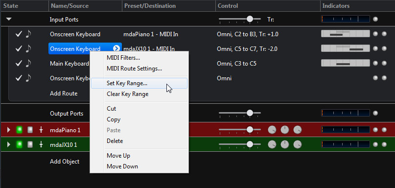
It looks like a fair solution for use when setting up songs, as long as you’re happy to have your racks multi-coloured etc. But the need to cross reference visually by colour feels cumbersome to me. How about interlacing horizontal bars into the route rows in some way, so the visual indication is right where you go to edit the ranges? It would also clarify the situation when you’re using multiple MIDI controllers. Perhaps this in addition to the on screen keyboard.
Also, for those who need to use colour for something else, defaulting to one colour and having the key range bar light up when a key is routed in that zone?
Another approach might be to have the ranges appear in a separate horizontal widget that you can stack below the onscreen keyboard, or alternatively have displayed on its own. This would be great in live mode where you often just need to remember the rough zone layout for a given song state, and don’t necessarily need to see exact split points.
Neil


